The CSS height and width properties are used to set the height and width of an element.
The CSS max-width property is used to set the maximum width of an element.
The height and width properties do not include padding, borders, or margins. It sets the height/width of the area inside the padding, border, and margin of the element.
CSS height and width Values
The height and width properties may have the following values:
- auto - This is default. The browser calculates the height and width
- length - Defines the height/width in px, cm, etc.
- % - Defines the height/width in percent of the containing block
- initial - Sets the height/width to its default value
- inherit - The height/width will be inherited from its parent value
index.html
<!DOCTYPE html>
<html lang="en">
<head>
<meta charset="UTF-8">
<meta name="viewport" content="width=device-width, initial-scale=1.0">
<title>width and height</title>
<link rel="stylesheet" href="style.css">
</head>
<body>
<h1>Width and Height</h1>
<div>Lorem ipsum dolor sit amet consectetur adipisicing elit. Ratione, ducimus?</div>
</body>
</html>
style.css
* {
margin: 0;
padding: 0;
box-sizing: border-box;
}
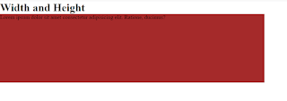
div {
width: 50%;
height: 200px;
background-color: brown;
}
Output:
Setting max-width
- The max-width property is used to set the maximum width of an element.
- The max-width can be specified in length values, like px, cm, etc., or in percent (%) of the containing block, or set to none (this is the default. Means that there is no maximum width).
- difference between width and max-width:
- if the window size is smaller than the width of the element then the browser will add a horizontal scrollbar to the page.
- to avoid this issue we need to use max-width so it will handle depending on the drowser.
- note: If some reason you used both the width property and the max-width property on the same element,
- and the value of the width property is larger than the max-width property; the max-width property will be used (and the width property will be ignored).
index.html
<!DOCTYPE html>
<html lang="en">
<head>
<meta charset="UTF-8">
<meta name="viewport" content="width=device-width, initial-scale=1.0">
<title>width and height</title>
<link rel="stylesheet" href="style.css">
</head>
<body>
<h1>Width and Height</h1>
<div>Lorem ipsum dolor sit amet consectetur adipisicing elit. Ratione, ducimus?</div>
</body>
</html>
style.css
* {
margin: 0;
padding: 0;
box-sizing: border-box;
}
div {
max-width: 200px;
height: 200px;
background-color: brown;
}
output:
- max-height -- maximum height of an element
- If the content is larger than the maximum height, it will overflow. How the container will handle the overflowing content is defined by the overflow property.
- If the content is smaller than the maximum height, the max-height property has no effect.


.png)


0 Comments:
Post a Comment
Do leave your comments